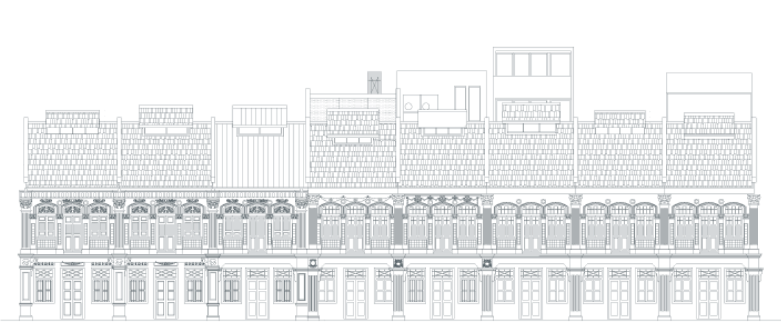
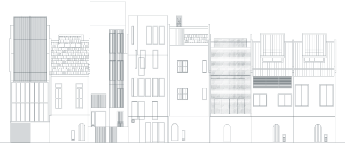
The Lorong 24A Shophouse Series is a boutique development involving a row of 1920s shophouses on a quaint street in Geylang. Selected architects integrate the best of both worlds—every shophouse has a similar, carefully-conserved façade, but each door opens up into an intriguingly different spatial experience, with each shophouse having their own uniquely designed stand-out features.
Considerable design freedom was accorded to the invited local architects, allowing them to explore the potential of each shophouse, breaking away from the standard design duplication present in most residential developments, refreshing notions of shophouse-living.
The curatorial approach taken to this development project allows tenants and residents to have their cake and eat it too, enjoying both the harmonious beauty of the collective exteriors, as well as the individualistic characterizations of interior worlds they can be proud to call home.
The Lorong 24A Shophouse Series was initiated and executed by Pocket Projects, a development consultancy firm specialising in boutique projects outside of the mainstream, and is now managed by Figment.
The Lorong24A Shophouse Series, comprising all eight units, has been awarded the URA Architectural Heritage Award (Category B) 2013. This is the first time a collective of shophouses have been recognized and awarded together. The URA Architectural Heritage Award serves to highlight projects where there is architectural innovation and excellence whilst preserving old heritage elements.
Unit 19 has been honoured with the SIA (Singapore Institute of Architects) Design Award 2012, and the URA Architectural Heritage Award (Category B). The SIA Architectural Design Awards is the most prestigious award conferred by SIA to promote and encourage distinction in architectural design.
The URA Architectural Heritage Award serves to highlight projects where there is architectural innovation and excellence whilst preserving old heritage elements.



The unique designs of the shophouse units have contributed to their popularity in the property market, attracting higher rents and/or earlier tenancy. Potential purchasers have expressed keen interest in the units from the start of the project and completed units have been very well-received by their new tenants, many of whom tend to be looking for a different living experience from other developments in Singapore.
Tenants have also fed back that they had considered renting other shophouses but had reservations because they fell short on design and practical livability until they found The Lorong 24A Shophouse Series.
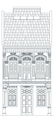
N° 5 is a relaxing, bohemian respite from the hustle and bustle of city life.
The preserved façade features original, coloured window panes. Stepping in, the ground floor has a wide wall expanse to accommodate the hanging of artwork, with a sheltered terrace in the rear for al fresco dining and some peace and quiet.
A small pond is tucked under the stairs, whilst a skylight lets in daylight in abundance, both onto the central staircase shaft and into surrounding rooms with rustic, exposed brick walls and old timber floors.
A quiet terrace in the master bedroom faces a green field—ideal for reading your papers leisurely on a Sunday morning, or enjoying the sunset with an evening drink in hand.
Atria Architects
Created with the idea of taking advantage of tall ceilings and wide spans, all units have been fitted with gallery tracks to facilitate display of art on walls, thus integrating gallery-like spaces into living areas.
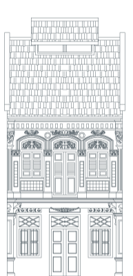
A play on lightness/transparency and a motif of connectedness permeate N° 9.
The historically-rich façade has been carefully preserved, as have been the old timber floor boards—supplemented where necessary with beautiful, authentic timber from kelongs.
The ground floor of the house is centred around a pond in conjunction with a reintroduced central airwell which allows natural airflow and connects occupants with the environment as it ‘rains in the living room’. Care has been taken to ensure that the rain water is contained within the pool, with the rest of the space remaining dry. Surrounding wooden decking invites al fresco dining and pool parties, within the comfort of one’s own living space.
The main staircase—hung on steel rods, made of perforated metal—preserves lightness, as one is able to see through it down to the pool. A small terrace links the front and rear of the house on the second level, ensuring flexibillty and privacy for both shared tenancy or an entire family. This airy verandah overlooks the pool, and adjacent planters can be maximised to introduce lush foliage into the void, where natural rainfall passes through into the pool below.
Design consultants: Liu & Wo Architects
Execution: Atria Architects
Created with the idea of taking advantage of tall ceilings and wide spans, all units have been fitted with gallery tracks to facilitate display of art on walls, thus integrating gallery-like spaces into living areas.
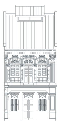
N° 11 is an unassuming yet intricate architectural tapestry weaving old and new, interior and exterior, via intriguing structural threads. Featuring a raw, pared down back-to-basics aesthetic, No.11 also provides occupants winning opportunities for full engagement with the tropical environment.
Sitting comfortably side by side, the old part of the house and new part of the house visually regard each other across an open central courtyard. The two structures are knit together by a central staircase comprising of thin steel bridges stretching from one level to the next, criss-crossing the courtyard space. As such, occupants pass through the old and new parts of the house in alternate fashion as one traverses this staircase.
The intertwining staircases act as a series of metal bridges—some straight, some curved, some kinked. The staircase balustrades are crafted from industrial mesh. Each flight is covered by a metal roof, upon which planters will be installed for plants, calling to mind a contemporary, scaled down Hanging Gardens.
The central courtyard features granite pavers and is shaded in part by the ascending metal bridges, making for a quiet chill spot. The entire courtyard is also protected by retractable awning in case of heavy rains.
The kitchen, in the new section at the rear, is sunk by 50cm below ground level. Along the full length of the kitchen runs a planter, which is open to the sky. Enjoy close proximity to the environment and views of greenery as you prepare meals or dine.
The old section has been lovingly restored, with preserved timber floors and joists, soaring ceiling heights and huge rooms. Care has also been taken to preserve old breeze blocks embedded in the existing party wall.
In contrast, the new rear comprises of a stack of small rooms, glassed on all four walls, surrounded by little terraces on each level. Ceilings and floors in the rear block will be of polished concrete, accented with coloured cabinetry. Fully opening the rooms’ glass panels allows free flow of air and a sense of openness. Surrounded by terraces, upon which plants can be placed, one could wake up surrounded by lush greenery, refreshed.
Linghao Architects
➊ Our proposal relates the front existing conserved block with sides of half flight level for the rear addition. In the middle, a stairwell circulates around the front and rear.
➋ The existing shophouse terrace space of a long, tall and enclosed interior to the front is contrasted and complemented with a series of smaller glass walled rooms surrounded by little terraces on different levels.
➌ If the usual shophouse terrace type is of continuous level floors, this design seeks to make a more vertically connected by relating the building at half levels. There is a more intimate interaction within the building as compared to purely separate levels.
➍ We suggest that it is a significant idea to be developed for the terrace housing type in making for a closer and dynamic section. For a building width of 6m, the possibilities of innovative thinking would lie in the vertical section. In this scenario, where the front is a conserved 2 storey building of overall envelope height of approximately 11800mm, there is an attempt o consider the possibilities of a rear addition that would be appropriate based on the ways of living.
➎ The building type of half levels is prevalent in, for example, the old quarters of Shanghai. There the density is matched by a precision and compactness of interior layout both in plan and section that is experientially both exciting and useful to this date.
Created with the idea of taking advantage of tall ceilings and wide spans, all units have been fitted with gallery tracks to facilitate display of art on walls, thus integrating gallery-like spaces into living areas.
(Perspectives/models and plans are only indicative, and may differ from the actual.)
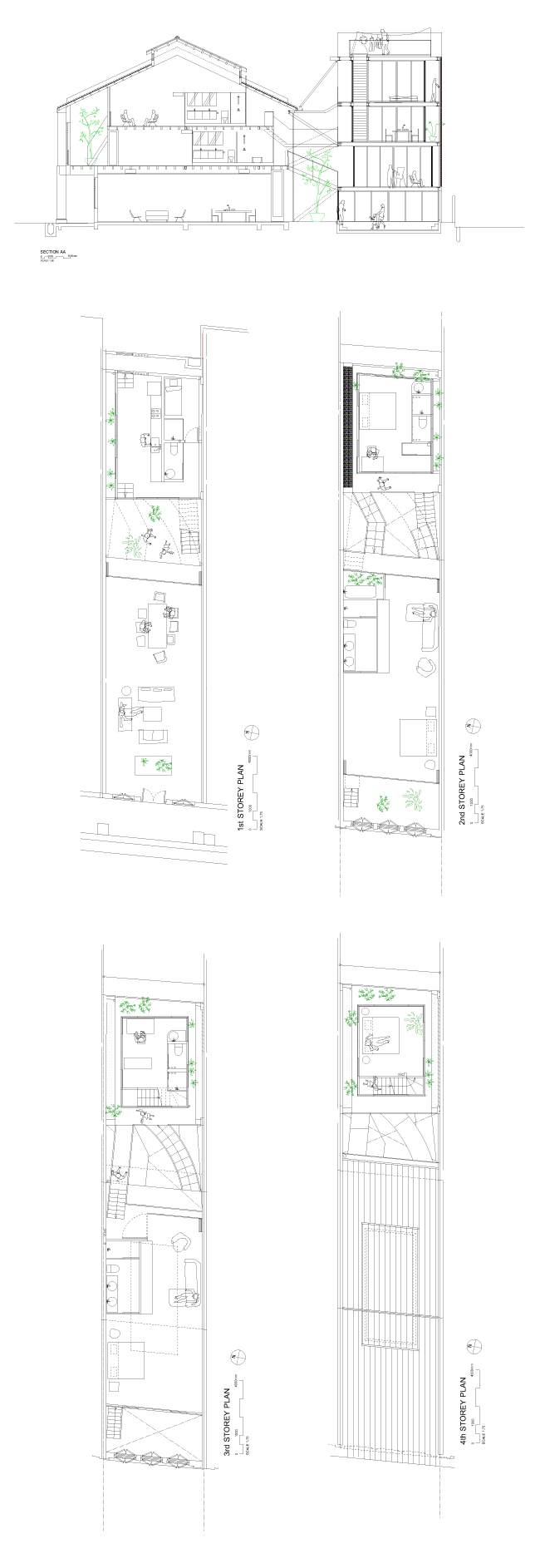
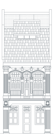
N° 13 is a Zen-esque oasis where clean lines meet a muted palette of whites and greys.
Care has been taken to preserve the old timber floorboards, joists and peephole.
Centred around a 4-storey light well overlaid by a glass and steel trellis, N° 13 enjoys much natural light and ventilation. Occupants are able to look up at a large piece of the sky, whilst fully-sheltered and protected from the elements.
A large pond, which spans almost the full width of the shophouse, also reflects the sky as seen through the glass trellis overhead. With the benefit of full sunlight, there is much potential here to create a lush floating landscape with aquatic plants such as water lilies.
An island kitchen divides the living room and dining room. The latter is sited next to the pond, where diners can enjoy contemplative views of the water, making for an ideal entertainment space.
An elegant study in juxtaposition is also presented: a suspended, angular steel spiral staircase hovers over the kitchen, contrasting with the heavy, sensual curves of the red dragon-esque steel spiral staircase above the pond, in the void of the light well.
A large, open roof terrace lies in wait at the top of the sculptural spiral stairs—the perfect setting for residents to install a luxurious, standalone jacuzzi, or simply, to take in the surrounding rooftop views awash in the sunset.
HYLA architects
N° 13 Geylang is a shophouse conservation and extension project. Within the existing main building, a vertical trellised volume is introduced which creates a connecting feature. A steel staircase is placed within the volume and a skylight introduced above. This creates a dramatic effect as light penetrates through down to the kitchen on the 1st storey, the master bath and the bedroom on the new mezzanine level. The 1st storey living uses an open plan, creating a smooth transition from the living to the dining room, partitioned by the island kitchen. The space connects one through the entire length of the shophouse with a view of the courtyard and the extension behind.
The new 4 storey extension houses 3 additional bedrooms and a roof terrace. A 4-storey void is crafted between the existing and the new, where a sculptural spiral staircase connects to the roof terrace. The distinct volume is enhanced by the roof trellis that filters the light through the void down to the reflecting pond below.
Created with the idea of taking advantage of tall ceilings and wide spans, all units have been fitted with gallery tracks to facilitate display of art on walls, thus integrating gallery-like spaces into living areas.
(Perspectives/models and plans are only indicative, and may differ from the actual.)
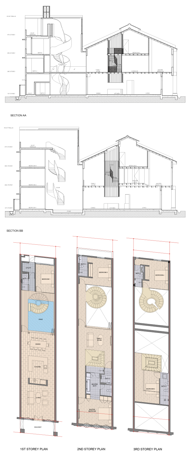
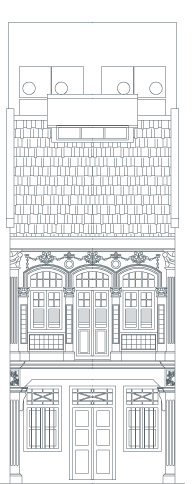
N° 15 is an exercise in careful sculpting of space from massing, where modern sophistication meets the preservation of tradition.
Old timber boards, joists and the peephole have been preserved. The conservation front portion housing the living room swiftly opens up into the dining room, a massive, double height volume space with an angled feature ceiling. Conceived as a ‘living gallery’, the wide walls of the dining room are suitable for large art pieces, whilst the tall heights accommodate grand installation pieces. This creates the intimate sensation of dining in an art gallery—the one place in which food and drink has always been strictly forbidden.
The feature stairwell is canyon-like, irregularly shaped, sculptural. Created by large slanted walls, with windows allowing surrounding rooms to look in, it is lit naturally via a large skylight at the top.
The entire rear block above the dining space has been twisted at an angle, and the rooms above hover over this void. Most bedrooms are designed with double height ceilings; all have adequate natural light to feel bright and airy. The introduction of pocket garden spaces throughout the house also ensures most rooms have a view of or a peek at some greenery.
A bathroom shower opens up into an unbarred, yet private garden space, as well as a roof terrace with surrounding views all the way to Marina Bay Sands.
The simplicity of white finishings abound in this unit, with stylish contemporary details keeping things interesting—laser cut patterned screens for the rear windows, geometrically-patterned dark granite paving for the dining room/gallery.
Ong Ker-Shing Architects
The design for the home at 15 Lorong 24a, Geylang, is a unique combination of home and gallery. Designed for an art collection, it will provide a high-specification environment for the display of painting, installation, and sculpture. The unique nature of this proposal concerns the way in which these programs are combined—rather than separating the functions of the house and the gallery, the design brings programs such as living and dining into close contact with art at all points. It is less a home with art, and more an art gallery for inhabitation.
An important feature of this design is the addition of a “living gallery” and bedrooms at the rear of the existing shophouse. This is designed in a striking massing, such that the bedrooms appear to be suspended above the Living Gallery. A feature bedroom is fitted with windows, such that it can look down on the gallery from above.
To this end, the interior and rear extensions have been designed according to the requirements for the display of both historical and contemporary art.
Created with the idea of taking advantage of tall ceilings and wide spans, all units have been fitted with gallery tracks to facilitate display of art on walls, thus integrating gallery-like spaces into living areas.
(Perspectives/models and plans are only indicative, and may differ from the actual.)

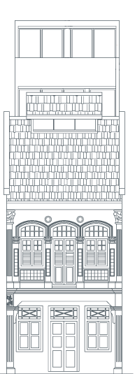
N° 17 is an exploratory, youthful, almost Postmodern take on the shophouse, featuring the pairing of a gritty-trendy industrial aesthetic with imaginative, whimsical structural surprises as a clever counterpoint.
The tallest unit in the Lorong 24A Shophouse Series, No.17, with its white, monochromatic interiors, also affords spectacular views from its top floor terrace.
Stepping in, a linear reflective pond delineates a formal entrance foyer, which one crosses via granite slabs into the house proper. A metal platform bridge with industrial mesh balustrades runs the length of the house. Alongside the bridge is a double storey height wooden bookshelf set against the shophouse wall, appealing to the fantasy of having your own library, while the island open-plan kitchen is ideal for lazy breakfasts.
Walking up the platform bridge affords views down into the ground floor living room, while ascending into the day room and second living room space—suspended playfully above the first in an industrial mesh cage. The floor of the second living room has been kept translucent to allow light to filter down to the space below.
The unit is built for exploration, and rewards residents with eclectic elements amidst its industrial flavour. Experience the progressive increase in heights as you walk down the length of the shophouse to the rear. An initial ramble around the building yields delights like stumbling upon an elegantly crafted metal spiral staircase leading to a quiet meditation room. A hidden dryscaped secret garden on the third floor offers a quiet contemplative space.
The meditation room is set closest to the original roof. Vintage timber rafters have been preserved; plaster on the walls have been carefully chipped away, revealing original brick work installed when the house was first built, bringing you close to the beauty of yesteryear.
ZARCH collaboratives
“How should our new building interact with the old shophouse?”
In searching for an answer to the above question, we arrived at a decision to simply sit the new next to the old, because the old should be appreciated and the new should be welcomed.
The first floor which houses the public functions of this residence, is a continuous series of spaces that runs through to the back. A few matters past the entry, a spiral staircase that extends to the topmost floor quickly provides a re-orientation along the vertical axis. Thus upon entry, one can immediately sense the scale of the shop-house, comprehending it in terms of its depth and its height.
Up the spiral staircase onto the second floor, a bridge leads you to the back of the residence which houses the new wing. Being a composition of boxes stacked one above the other, it reflects the modernized typology in which most of our city dwellers now exists in.
However, slight adjustments to the sizing and the stacking of the boxes allowed the insertion of its sheltered terrace and the creation of a double height volume with large openings. Both instances, drew the inside to the outside, establishing between the old shop-house and new spaces visual connection and physical proximity
To sum up, we will like our design intervention to be perceived as such,
“The old and the new share a common ground.
On it, they sit comfortably next to each other.”
Created with the idea of taking advantage of tall ceilings and wide spans, all units have been fitted with gallery tracks to facilitate display of art on walls, thus integrating gallery-like spaces into living areas.
(Perspectives/models and plans are only indicative, and may differ from the actual.)

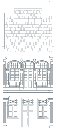
N° 19 displaces one’s senses unexpectedly via the harmonious interplay of old and new.
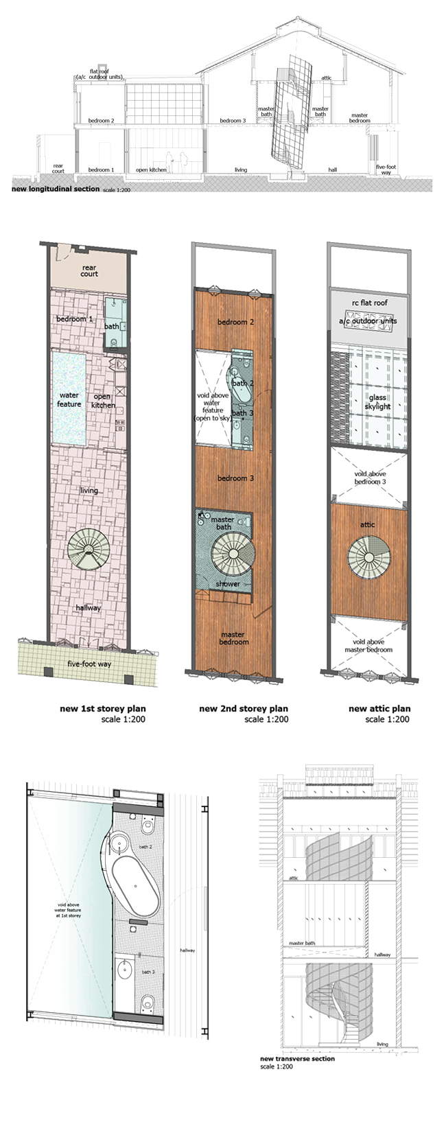
Original window panels are featured in the elegant simplicity of the grey conserved façade. A spiral staircase with stainless steel checkered plate steps and a skewed central axis is a standout feature, beyond which is the living room, whose walls are equipped with gallery hanging tracks and lighting, to be utilized for the display of artwork. The dining room follows, with a pond, naturally lit and ventilated by a double volume airwell, which also discreetly separates the old building and the new extension.
On the second level, a sensual curvature has been worked into the design to facilitate the placement of a full-length bathtub set in rustic cement boasting a view of the sky overhead through aluminum and glass trellis designed to provide the best of both worlds - good views outwards and privacy inwards.
The stylish staircase ends on an axis as the centrepoint in a room at the top ofthe stairs, complete with a jackroof constructed with selected glass openings for the sunlight to filter through
N° 19, designed by HYLA Architects (www.hyla.com.sg/aha2011), has also been awarded the URA Architectural Heritage Award (Category B), which highlight projects that showcase architectural innovation and excellence whilst preserving elements of old heritage.
N° 19 has since been tenanted to a well-travelled couple. Having lived in New York, London, Mumbai, Tokyo and Shanghai over the years, they are now happy to call Lorong 24A home.
HYLA Architects
Giving a breath of fresh air to the old, the conservation and extension of No.19 showcases the engagement of contemporary design sensibilities with the uniqueness of the shophouse archetype.
The main building Beyond its ornate façade, the main building houses the living and dining room on the first floor, two bedrooms on the second floor, and a third bedroom on a new mezzanine floor. A spiral staircase with stainless steel checkered plate steps gently spirals up along a skewed central axis, serving as vertical circulation. As sunlight penetrates through the newly-constructed jackroof, the staircase exudes an ephemeral feel as light filters through.
The rear extension Except for the full-height French windows on the second floor, design of the rear extension is kept minimal. With one new bedroom on each floor of the extension, the house now has a total of five distinct bedrooms and a creation of a transitional space between the main building and the extension
The in-between Naturally lit and ventilated, a pond and a double volume airwell along one side of the house discreetly separate the main building and the new extension. On the other side, the kitchen on the first floor opens to the pond while a curvaceous screen hides bathrooms on the second floor. Giving function to the otherwise transitional space, the in-between becomes a destination itself, enriching the experience of a seamless home.
Created with the idea of taking advantage of tall ceilings and wide spans, all units have been fitted with gallery tracks to facilitate display of art on walls, thus integrating gallery-like spaces into living areas.
(Perspectives/models and plans are only indicative, and may differ from the actual.)

N° 21 is an honest, spacious reinvention of the shophouse form, injected with spatial fluidity and airy brightness, which run contrary to the notion of the narrow darkness of the traditional shophouse.
The archetypal length on the shophouse is visually accentuated by the long, heated lap pool on the ground floor, replete with deck chairs. Take a morning dip, or do evening laps, in the indulgence of the interior of your own home. A gradual ascent up platform stairs takes one into the dining room, with an emphasis made on the open fluidity of the space, with the pool below.
The dining room-cum-entertainment area and open plan kitchen receive full daylight and fresh air from a full wall of windows at the rear, creating an atmospheric, expansive experience perfect for both leisurely weekend brunches and quick weekday meals. The proximity of the pool and the visual linkage between the living and dining spaces allow full-swing poolside parties right in the comfort of one’s own home.
A large skylight in the middle of the unit continues this fixation of light and space, allowing light down into nooks and crannies. All bedrooms have been designed to receive adequate natural daylight and ventilation. A series of stairs loop the length of the shophouse on various levels, facilitating the dialogue between old and new.
Elegant finishings and features abound in this home. A luxurious double height master bathroom reaches all the way to the jack roof, allowing light to filter down to the tub.
The classy roof terrace is large, with much potential for various interpretations—a lush rooftop garden? Sheltered daybeds? The spacious terrace affords great views, and is perfect for barbecue group parties or evening drinks for two under the stars.
KD Architects with FARM
The conversation with the existing shophouse started with the intention to read the ‘new’ not as a ‘rear extension’ but as an ‘insertion’. We were keen to understand the spatial opportunities with such a configuration while heightening a unique experience inherent within the spatial structure of a shophouse.
The monolithic lap pool on the first storey serves to emphasise the linear typology of the space, as it guides one’s gaze and experience from the front to the rear. Extending this idea of linearity is the monolithic volume terminating at the rear, housing the private quarters on the upper levels.
One experiences the continuity of space through a series of stairs that loop the length of the shophouse on multi levels, the dialogue between the old and new constantly questioned and revealed through the shift in geometry, height, volume and material. Central to this continuous loop is the skylight that marks the vital interface, providing not only a functional source of light in this marrow linear space, but more importantly, a visual connection through the parts of the house.
The connection between the conserved shophouse and the new insertion is mediated through a high volume space at the rear or the void, here one sees the charity in geometry of these 2 objects, of the inserted and the existing. It is also in this critical space where one experiences the essence of the shophouse, not merely in its retention of the façade envelope, but also the integrity of the spatial structure. Thus, this conscious effort to cross these series of the thresholds enhances one’s appreciation of this insertion while providing a spatially exciting experience through the various sections of the shophouse.
Created with the idea of taking advantage of tall ceilings and wide spans, all units have been fitted with gallery tracks to facilitate display of art on walls, thus integrating gallery-like spaces into living areas.
(Perspectives/models and plans are only indicative, and may differ from the actual.)

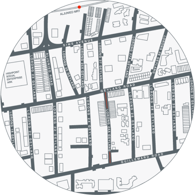
The project also highlights Lorong 24A as an oft-overlooked pocket of quirky charm and old-world calm amidst the rest of Geylang, an area typically associated with red-light activity.
In contrast to the adjacent streets, Lorong 24A has never had a history of red-light activity. It is instead home to an eclectic myriad of old and new small businesses, ranging from a traditional Chinese medicine shop (replete with resident shop cat, rosewood furniture and glass jars) to a flamenco dance studio-cum-café. The coffee shop at the end of the Lorong also boasts delicious wanton and prawn noodles. The street also houses a number of old Chinese clan associations with vintage signages, as well as a Buddhist library.
Lorong 24A is also a five-minute walk away from Aljunied MRT and a ten minute drive to the Central Business District.
The Lorong 24A Shophouse Series also hopes to demystify a slice of Geylang in its own manner; with residents contributing to the laidback vibe whilst appreciating the charming eccentricities and historical richness of the street.
Geylang is arguably the most colourful enclave in Singapore, managing to mix food, sex, history and vintage charm. Delicious and varied nosh can be found here at unassuming prices, from Szechuan hotpot to Indian roti-john to Teochew porridge and turtle soup. 24 hour eateries for late-night suppers are found in abundance, such as the famed No. 126 dim-sum, or the silken Rochor Road beancurd. Religious institutions and clan associations sit cheek by jowl with hourly-rate hotels and karaoke pubs.
Geylang is an area that has resisted gentrification and clinical overhauls, maintaining a strong flavour of refreshing realism that has not succumbed to sterility.
The Lorong 24A Shophouse Series was initiated and executed by Pocket Projects, a development consultancy firm with a keen interest in bringing niche projects to life.
Pocket Projects is run by Karen Tan. Her familiarity with and passion for architecture, coupled with a background in real estate investment banking at Citigroup London and as Head of Development Finance in British real estate firm First Base, places Pocket Projects in good stead in its pursuit of well-curated, thoughtfully-designed projects that make good on investors’ return-on-capital.
Pocket Projects possesses full expertise to oversee the value-chain of operations—from initial conceptualization, the careful selection of architects and giving design input, through to financing and construction, as well as marketing and leasing. Pocket Projects also places a premium on good design, which has the potential to enrich a development by enhancing its functionality and, therefore, financial value.
With an open approach to working on both new builds and existing structures, across various uses, Pocket Projects looks forward to engaging in the creation of more spatially-exciting projects existing in harmony with the local context and its environs.
The various local architects invited to be part of this collaboration were chosen on the basis of their design excellence and innovation, as well as their passion for the overall concept of the project. They are a mix of both experienced architectural practices as well as young up and coming designers.
It was key that their design approaches were different in order to come up with a collection of very different, but workable, solutions for the collection, with each unit imbued with a unique character.
The architecture firms are as follows: Atria Architects, KD Architects with FARM, HYLA, Lekker Design, Linghao Architects, Liu & Wo and Zarch Collaboratives.
The shophouses are owned by an art-loving lawyer and his group of close friends, who have been attracted to the potential of the street 10 to 15 years ago when they first purchased the units. Being passionate about architecture and local heritage, the owners have been supportive in the conceptualization of the project and share its vision.
The Lorong 24A Shophouse Series also bears in mind, literally and figuratively, the owners’ 3 word request at the start: “Give us Art.” This is executed in both the artistic, architectural treatments received by the shophouses, as well as the care taken to facilitate the display of art within the homes.

N° 5 is a relaxing, bohemian respite from the hustle and bustle of city life.
The preserved façade features original, coloured window panes. Stepping in, the ground floor has a wide wall expanse to accommodate the hanging of artwork, with a sheltered terrace in the rear for al fresco dining and some peace and quiet.
A small pond is tucked under the stairs, whilst a skylight lets in daylight in abundance, both onto the central staircase shaft and into surrounding rooms with rustic, exposed brick walls and old timber floors.
A quiet terrace in the master bedroom faces a green field—ideal for reading your papers leisurely on a Sunday morning, or enjoying the sunset with an evening drink in hand.
Atria Architects
Created with the idea of taking advantage of tall ceilings and wide spans, all units have been fitted with gallery tracks to facilitate display of art on walls, thus integrating gallery-like spaces into living areas.

A play on lightness/transparency and a motif of connectedness permeate N° 9.
The historically-rich façade has been carefully preserved, as have been the old timber floor boards—supplemented where necessary with beautiful, authentic timber from kelongs.
The ground floor of the house is centred around a pond in conjunction with a reintroduced central airwell which allows natural airflow and connects occupants with the environment as it ‘rains in the living room’. Care has been taken to ensure that the rain water is contained within the pool, with the rest of the space remaining dry. Surrounding wooden decking invites al fresco dining and pool parties, within the comfort of one’s own living space.
The main staircase—hung on steel rods, made of perforated metal—preserves lightness, as one is able to see through it down to the pool. A small terrace links the front and rear of the house on the second level, ensuring flexibillty and privacy for both shared tenancy or an entire family. This airy verandah overlooks the pool, and adjacent planters can be maximised to introduce lush foliage into the void, where natural rainfall passes through into the pool below.
Design consultants: Liu & Wo Architects
Execution: Atria Architects
Created with the idea of taking advantage of tall ceilings and wide spans, all units have been fitted with gallery tracks to facilitate display of art on walls, thus integrating gallery-like spaces into living areas.

N° 11 is an unassuming yet intricate architectural tapestry weaving old and new, interior and exterior, via intriguing structural threads. Featuring a raw, pared down back-to-basics aesthetic, No.11 also provides occupants winning opportunities for full engagement with the tropical environment.
Sitting comfortably side by side, the old part of the house and new part of the house visually regard each other across an open central courtyard. The two structures are knit together by a central staircase comprising of thin steel bridges stretching from one level to the next, criss-crossing the courtyard space. As such, occupants pass through the old and new parts of the house in alternate fashion as one traverses this staircase.
The intertwining staircases act as a series of metal bridges—some straight, some curved, some kinked. The staircase balustrades are crafted from industrial mesh. Each flight is covered by a metal roof, upon which planters will be installed for plants, calling to mind a contemporary, scaled down Hanging Gardens.
The central courtyard features granite pavers and is shaded in part by the ascending metal bridges, making for a quiet chill spot. The entire courtyard is also protected by retractable awning in case of heavy rains.
The kitchen, in the new section at the rear, is sunk by 50cm below ground level. Along the full length of the kitchen runs a planter, which is open to the sky. Enjoy close proximity to the environment and views of greenery as you prepare meals or dine.
The old section has been lovingly restored, with preserved timber floors and joists, soaring ceiling heights and huge rooms. Care has also been taken to preserve old breeze blocks embedded in the existing party wall.
In contrast, the new rear comprises of a stack of small rooms, glassed on all four walls, surrounded by little terraces on each level. Ceilings and floors in the rear block will be of polished concrete, accented with coloured cabinetry. Fully opening the rooms’ glass panels allows free flow of air and a sense of openness. Surrounded by terraces, upon which plants can be placed, one could wake up surrounded by lush greenery, refreshed.
Linghao Architects
➊ Our proposal relates the front existing conserved block with sides of half flight level for the rear addition. In the middle, a stairwell circulates around the front and rear.
➋ The existing shophouse terrace space of a long, tall and enclosed interior to the front is contrasted and complemented with a series of smaller glass walled rooms surrounded by little terraces on different levels.
➌ If the usual shophouse terrace type is of continuous level floors, this design seeks to make a more vertically connected by relating the building at half levels. There is a more intimate interaction within the building as compared to purely separate levels.
➍ We suggest that it is a significant idea to be developed for the terrace housing type in making for a closer and dynamic section. For a building width of 6m, the possibilities of innovative thinking would lie in the vertical section. In this scenario, where the front is a conserved 2 storey building of overall envelope height of approximately 11800mm, there is an attempt o consider the possibilities of a rear addition that would be appropriate based on the ways of living.
➎ The building type of half levels is prevalent in, for example, the old quarters of Shanghai. There the density is matched by a precision and compactness of interior layout both in plan and section that is experientially both exciting and useful to this date.
Created with the idea of taking advantage of tall ceilings and wide spans, all units have been fitted with gallery tracks to facilitate display of art on walls, thus integrating gallery-like spaces into living areas.
(Perspectives/models and plans are only indicative, and may differ from the actual.)


N° 13 is a Zen-esque oasis where clean lines meet a muted palette of whites and greys.
Care has been taken to preserve the old timber floorboards, joists and peephole.
Centred around a 4-storey light well overlaid by a glass and steel trellis, N° 13 enjoys much natural light and ventilation. Occupants are able to look up at a large piece of the sky, whilst fully-sheltered and protected from the elements.
A large pond, which spans almost the full width of the shophouse, also reflects the sky as seen through the glass trellis overhead. With the benefit of full sunlight, there is much potential here to create a lush floating landscape with aquatic plants such as water lilies.
An island kitchen divides the living room and dining room. The latter is sited next to the pond, where diners can enjoy contemplative views of the water, making for an ideal entertainment space.
An elegant study in juxtaposition is also presented: a suspended, angular steel spiral staircase hovers over the kitchen, contrasting with the heavy, sensual curves of the red dragon-esque steel spiral staircase above the pond, in the void of the light well.
A large, open roof terrace lies in wait at the top of the sculptural spiral stairs—the perfect setting for residents to install a luxurious, standalone jacuzzi, or simply, to take in the surrounding rooftop views awash in the sunset.
HYLA architects
N° 13 Geylang is a shophouse conservation and extension project. Within the existing main building, a vertical trellised volume is introduced which creates a connecting feature. A steel staircase is placed within the volume and a skylight introduced above. This creates a dramatic effect as light penetrates through down to the kitchen on the 1st storey, the master bath and the bedroom on the new mezzanine level. The 1st storey living uses an open plan, creating a smooth transition from the living to the dining room, partitioned by the island kitchen. The space connects one through the entire length of the shophouse with a view of the courtyard and the extension behind.
The new 4 storey extension houses 3 additional bedrooms and a roof terrace. A 4-storey void is crafted between the existing and the new, where a sculptural spiral staircase connects to the roof terrace. The distinct volume is enhanced by the roof trellis that filters the light through the void down to the reflecting pond below.
Created with the idea of taking advantage of tall ceilings and wide spans, all units have been fitted with gallery tracks to facilitate display of art on walls, thus integrating gallery-like spaces into living areas.
(Perspectives/models and plans are only indicative, and may differ from the actual.)


N° 15 is an exercise in careful sculpting of space from massing, where modern sophistication meets the preservation of tradition.
Old timber boards, joists and the peephole have been preserved. The conservation front portion housing the living room swiftly opens up into the dining room, a massive, double height volume space with an angled feature ceiling. Conceived as a ‘living gallery’, the wide walls of the dining room are suitable for large art pieces, whilst the tall heights accommodate grand installation pieces. This creates the intimate sensation of dining in an art gallery—the one place in which food and drink has always been strictly forbidden.
The feature stairwell is canyon-like, irregularly shaped, sculptural. Created by large slanted walls, with windows allowing surrounding rooms to look in, it is lit naturally via a large skylight at the top.
The entire rear block above the dining space has been twisted at an angle, and the rooms above hover over this void. Most bedrooms are designed with double height ceilings; all have adequate natural light to feel bright and airy. The introduction of pocket garden spaces throughout the house also ensures most rooms have a view of or a peek at some greenery.
A bathroom shower opens up into an unbarred, yet private garden space, as well as a roof terrace with surrounding views all the way to Marina Bay Sands.
The simplicity of white finishings abound in this unit, with stylish contemporary details keeping things interesting—laser cut patterned screens for the rear windows, geometrically-patterned dark granite paving for the dining room/gallery.
Ong Ker-Shing Architects
The design for the home at 15 Lorong 24a, Geylang, is a unique combination of home and gallery. Designed for an art collection, it will provide a high-specification environment for the display of painting, installation, and sculpture. The unique nature of this proposal concerns the way in which these programs are combined—rather than separating the functions of the house and the gallery, the design brings programs such as living and dining into close contact with art at all points. It is less a home with art, and more an art gallery for inhabitation.
An important feature of this design is the addition of a “living gallery” and bedrooms at the rear of the existing shophouse. This is designed in a striking massing, such that the bedrooms appear to be suspended above the Living Gallery. A feature bedroom is fitted with windows, such that it can look down on the gallery from above.
To this end, the interior and rear extensions have been designed according to the requirements for the display of both historical and contemporary art.
Created with the idea of taking advantage of tall ceilings and wide spans, all units have been fitted with gallery tracks to facilitate display of art on walls, thus integrating gallery-like spaces into living areas.
(Perspectives/models and plans are only indicative, and may differ from the actual.)


N° 17 is an exploratory, youthful, almost Postmodern take on the shophouse, featuring the pairing of a gritty-trendy industrial aesthetic with imaginative, whimsical structural surprises as a clever counterpoint.
The tallest unit in the Lorong 24A Shophouse Series, No.17, with its white, monochromatic interiors, also affords spectacular views from its top floor terrace.
Stepping in, a linear reflective pond delineates a formal entrance foyer, which one crosses via granite slabs into the house proper. A metal platform bridge with industrial mesh balustrades runs the length of the house. Alongside the bridge is a double storey height wooden bookshelf set against the shophouse wall, appealing to the fantasy of having your own library, while the island open-plan kitchen is ideal for lazy breakfasts.
Walking up the platform bridge affords views down into the ground floor living room, while ascending into the day room and second living room space—suspended playfully above the first in an industrial mesh cage. The floor of the second living room has been kept translucent to allow light to filter down to the space below.
The unit is built for exploration, and rewards residents with eclectic elements amidst its industrial flavour. Experience the progressive increase in heights as you walk down the length of the shophouse to the rear. An initial ramble around the building yields delights like stumbling upon an elegantly crafted metal spiral staircase leading to a quiet meditation room. A hidden dryscaped secret garden on the third floor offers a quiet contemplative space.
The meditation room is set closest to the original roof. Vintage timber rafters have been preserved; plaster on the walls have been carefully chipped away, revealing original brick work installed when the house was first built, bringing you close to the beauty of yesteryear.
ZARCH collaboratives
“How should our new building interact with the old shophouse?”
In searching for an answer to the above question, we arrived at a decision to simply sit the new next to the old, because the old should be appreciated and the new should be welcomed.
The first floor which houses the public functions of this residence, is a continuous series of spaces that runs through to the back. A few matters past the entry, a spiral staircase that extends to the topmost floor quickly provides a re-orientation along the vertical axis. Thus upon entry, one can immediately sense the scale of the shop-house, comprehending it in terms of its depth and its height.
Up the spiral staircase onto the second floor, a bridge leads you to the back of the residence which houses the new wing. Being a composition of boxes stacked one above the other, it reflects the modernized typology in which most of our city dwellers now exists in.
However, slight adjustments to the sizing and the stacking of the boxes allowed the insertion of its sheltered terrace and the creation of a double height volume with large openings. Both instances, drew the inside to the outside, establishing between the old shop-house and new spaces visual connection and physical proximity
To sum up, we will like our design intervention to be perceived as such,
“The old and the new share a common ground.
On it, they sit comfortably next to each other.”
Created with the idea of taking advantage of tall ceilings and wide spans, all units have been fitted with gallery tracks to facilitate display of art on walls, thus integrating gallery-like spaces into living areas.
(Perspectives/models and plans are only indicative, and may differ from the actual.)


N° 19 displaces one’s senses unexpectedly via the harmonious interplay of old and new.
Original window panels are featured in the elegant simplicity of the grey conserved façade. A spiral staircase with stainless steel checkered plate steps and a skewed central axis is a standout feature, beyond which is the living room, whose walls are equipped with gallery hanging tracks and lighting, to be utilized for the display of artwork. The dining room follows, with a pond, naturally lit and ventilated by a double volume airwell, which also discreetly separates the old building and the new extension.
On the second level, a sensual curvature has been worked into the design to facilitate the placement of a full-length bathtub set in rustic cement boasting a view of the sky overhead through aluminum and glass trellis designed to provide the best of both worlds - good views outwards and privacy inwards.
The stylish staircase ends on an axis as the centrepoint in a room at the top ofthe stairs, complete with a jackroof constructed with selected glass openings for the sunlight to filter through
N° 19, designed by HYLA Architects (www.hyla.com.sg/aha2011), has also been awarded the URA Architectural Heritage Award (Category B), which highlight projects that showcase architectural innovation and excellence whilst preserving elements of old heritage.
N° 19 has since been tenanted to a well-travelled couple. Having lived in New York, London, Mumbai, Tokyo and Shanghai over the years, they are now happy to call Lorong 24A home.
HYLA Architects
Giving a breath of fresh air to the old, the conservation and extension of No.19 showcases the engagement of contemporary design sensibilities with the uniqueness of the shophouse archetype.
The main building Beyond its ornate façade, the main building houses the living and dining room on the first floor, two bedrooms on the second floor, and a third bedroom on a new mezzanine floor. A spiral staircase with stainless steel checkered plate steps gently spirals up along a skewed central axis, serving as vertical circulation. As sunlight penetrates through the newly-constructed jackroof, the staircase exudes an ephemeral feel as light filters through.
The rear extension Except for the full-height French windows on the second floor, design of the rear extension is kept minimal. With one new bedroom on each floor of the extension, the house now has a total of five distinct bedrooms and a creation of a transitional space between the main building and the extension
The in-between Naturally lit and ventilated, a pond and a double volume airwell along one side of the house discreetly separate the main building and the new extension. On the other side, the kitchen on the first floor opens to the pond while a curvaceous screen hides bathrooms on the second floor. Giving function to the otherwise transitional space, the in-between becomes a destination itself, enriching the experience of a seamless home.
Created with the idea of taking advantage of tall ceilings and wide spans, all units have been fitted with gallery tracks to facilitate display of art on walls, thus integrating gallery-like spaces into living areas.
(Perspectives/models and plans are only indicative, and may differ from the actual.)


N° 21 is an honest, spacious reinvention of the shophouse form, injected with spatial fluidity and airy brightness, which run contrary to the notion of the narrow darkness of the traditional shophouse.
The archetypal length on the shophouse is visually accentuated by the long, heated lap pool on the ground floor, replete with deck chairs. Take a morning dip, or do evening laps, in the indulgence of the interior of your own home. A gradual ascent up platform stairs takes one into the dining room, with an emphasis made on the open fluidity of the space, with the pool below.
The dining room-cum-entertainment area and open plan kitchen receive full daylight and fresh air from a full wall of windows at the rear, creating an atmospheric, expansive experience perfect for both leisurely weekend brunches and quick weekday meals. The proximity of the pool and the visual linkage between the living and dining spaces allow full-swing poolside parties right in the comfort of one’s own home.
A large skylight in the middle of the unit continues this fixation of light and space, allowing light down into nooks and crannies. All bedrooms have been designed to receive adequate natural daylight and ventilation. A series of stairs loop the length of the shophouse on various levels, facilitating the dialogue between old and new.
Elegant finishings and features abound in this home. A luxurious double height master bathroom reaches all the way to the jack roof, allowing light to filter down to the tub.
The classy roof terrace is large, with much potential for various interpretations—a lush rooftop garden? Sheltered daybeds? The spacious terrace affords great views, and is perfect for barbecue group parties or evening drinks for two under the stars.
KD Architects with FARM
The conversation with the existing shophouse started with the intention to read the ‘new’ not as a ‘rear extension’ but as an ‘insertion’. We were keen to understand the spatial opportunities with such a configuration while heightening a unique experience inherent within the spatial structure of a shophouse.
The monolithic lap pool on the first storey serves to emphasise the linear typology of the space, as it guides one’s gaze and experience from the front to the rear. Extending this idea of linearity is the monolithic volume terminating at the rear, housing the private quarters on the upper levels.
One experiences the continuity of space through a series of stairs that loop the length of the shophouse on multi levels, the dialogue between the old and new constantly questioned and revealed through the shift in geometry, height, volume and material. Central to this continuous loop is the skylight that marks the vital interface, providing not only a functional source of light in this marrow linear space, but more importantly, a visual connection through the parts of the house.
The connection between the conserved shophouse and the new insertion is mediated through a high volume space at the rear or the void, here one sees the charity in geometry of these 2 objects, of the inserted and the existing. It is also in this critical space where one experiences the essence of the shophouse, not merely in its retention of the façade envelope, but also the integrity of the spatial structure. Thus, this conscious effort to cross these series of the thresholds enhances one’s appreciation of this insertion while providing a spatially exciting experience through the various sections of the shophouse.
Created with the idea of taking advantage of tall ceilings and wide spans, all units have been fitted with gallery tracks to facilitate display of art on walls, thus integrating gallery-like spaces into living areas.
(Perspectives/models and plans are only indicative, and may differ from the actual.)

